Nintendo Life
Curated From www.nintendolife.com Check Them Out For More Content.
Nintendo Life: Metroidvanias are a hugely popular genre in the indie scene at the moment. Why did you want to make one, and which games in the genre have you played?
Ziliang Yang: Most of our team members are big fans of the genre. We play the most celebrated games around the genre a lot, including traditional examples like Castlevania and Super Metroid, as well as modern ones like Ori, Hollow Knight, etc. But we don’t only enjoy the marquee names in the genre – we’re also big fans of games like Guacamelee, La-Mulana, ATO, and Phoenotopia: Awakening.
At what point in the development process did you decide on Afterimage’s gorgeous hand-drawn visual identity?
It’s rather difficult to pin down the timing of this. We experimented with several different approaches to Afterimage’s visual style, and we eventually chose something we felt would distinguish Afterimage from the genre’s more popular aesthetics — something light and colorful.
The world of Engardin looks absolutely incredible and each area feels visually distinct from one another. What’s the process of designing these areas while also making them feel different but connected?
At the very beginning, we committed to creating a world with more realness and integrality. And in this way, we were clear that this would be a story about experiencing various difficulties and crossing the entire world in search of a very precious thing the protagonist searched for.
Under the guidance of this story, we were able to reasonably design various sceneries that were completely different and concatenate all these places with storylines and motivations.
How important is the use of colour when designing a world or characters, and what considerations do you have to make when using colour to create the mood or atmosphere of a particular location?
We had already confirmed our main storyline before designing the maps, and with that, we intentionally chose “red” and “flame” to imply the crisis at the beginning of the whole game, as well as arranging this evil force represented by “red flame” in the most dangerous endgame sequence.
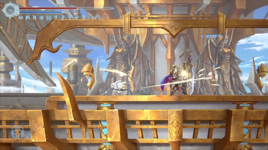
Meanwhile, we used “green” for early maps where you have just embarked on your journey; and “blue” for the territory of the Goliath of Hydro (Water), as it represents assistance and protection; “golden” for Holy Grounds to emphasize its majestic dignity. Using these overall color designs allowed us to not only highlight the characteristics and styles of different areas but also better match the emotional changes of the entire adventure story.
When creating Renee, the main character, what did you take into consideration to make her stand out in the world and against other Metroidvania protagonists?
Renee was not designed to be a “destined savior.” She gradually grew and turned herself from a protected person into a protector of others, as this kind of design enriched the characteristic of our protagonist. And because of this, Renee’s image might not appear to be overly “heroic.”
We actually did not consciously put much effort into differentiating our characters from other games but added importance to the worldview and Afterimage’s character relationships (as well as their motivations) — which, as a consequence, made Renee the one and only lead.
Many of the supporting characters have beautiful and eccentric designs based on animals. Can you tell us why you wanted to design lots of animal-based characters, how you incorporated them into the world, and if you have a favourite?
We intended to create a more diverse world where humans are just a part of an ecosystem made up of many intelligent lives, and different kinds of life have their own responsibilities and significance to jointly maintain the survival and development of Engardin.
We found that designs based on animals or plants can better convey their responsibilities and traits, such as birds flying in Albedo Tower; fishes swimming deep in the waters; cats shuttling through the jungle and mountains; mushrooms lurking in the caves; and vines twining the abandoned Holy Grounds. If you are curious about my favorite, it has to be the cats!
Was there anything you or the team particularly struggled with designing or incorporating into the game?
When we were experimenting and finding our own visual style, we encountered a problem where we wanted to make a Metroidvania with bright environments. But in scenes where the overall scenery was relatively bright, there might be issues with differentiating between the character and the foregrounds and backgrounds. Integrating the entire environment while ensuring the gameplay experience was easily understandable was a hard challenge early in development.
What do you think it is about hand-drawn visuals that capture people’s imagination so much?
To us, the hand-drawn style always had a unique charm, and we ourselves loved the tension presented by this particular art style. This unique tension could not be replaced with any other visual solutions.
This interview has been lightly edited for clarity.
Thank you so much to Ziliang Yang for taking the time to speak to us about Afterimage. You can grab this beautiful indie Metroidvania right now on Switch or all other platforms. Let us know if you’re playing the game and enjoying it in the comments!
