Nintendo Life
Curated From www.nintendolife.com Check Them Out For More Content.
We are back, back, back with another edition of Box Art Brawl!
Before we swing into this week’s match-up, let’s take a look at what went down last time when we looked at two regional covers for Metroid Prime 3: Corruption. Despite a duo of swanky designs being on display, it was Europe and North America’s dark, moodier cover that walked away with the win, taking 65% of the vote and leaving Japan’s brighter take with 35%.
Barelling into this week, we thought it was only right to show Donkey Kong some love, so we’re taking a look at three regional covers for DK: King of Swing on the GBA. It might not be topping anyone’s list of the best Donkey Kong games, but King of Swing is still a refreshing take on the ape gameplay from developer Paon, taking the essence of Clu Clu Land and making a fun little peg-climbing adventure out of it.
There are cover variants from Europe, North America and Japan to take in this time, so let’s get things rolling, shall we?
Be sure to cast your votes in the poll below; but first, let’s check out the box art designs themselves.
Europe
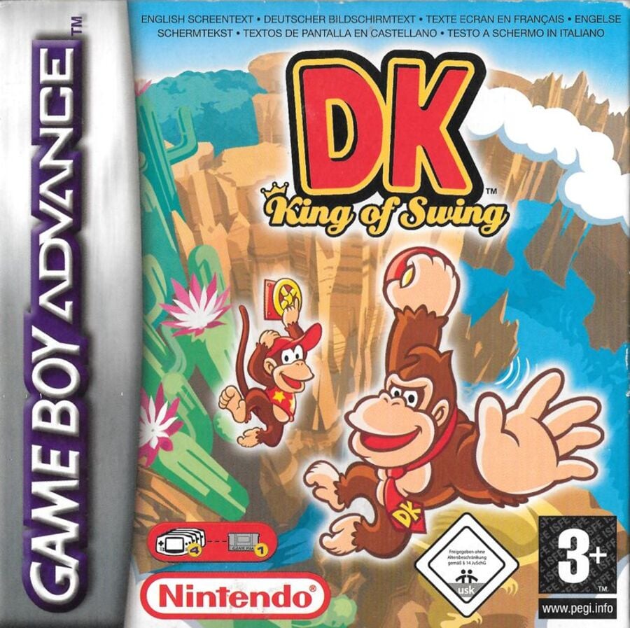
We’ll start off with the bright European design. In this instance, DK and Diddy take centre stage, each grabbing onto one of the in-game ‘pegs’ which float ominously in the air. It doesn’t make the most sense and the outer glow on the characters feels a little Photoshop-y, but we like the character art and the bright background is certainly eye-catching.
North America
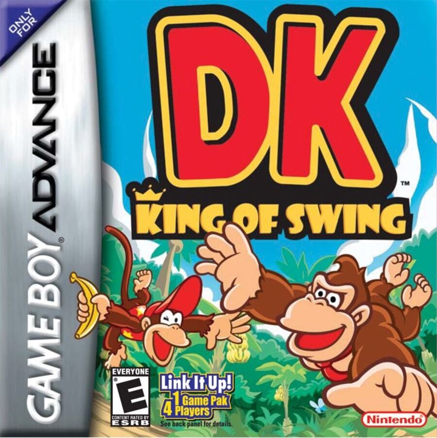
The North American variant is also nice and bright, but it’s missing the key ‘Swing’ component of the title. Instead of clinging onto a handhold, DK and Diddy are seen free-falling here. Hey, at least they look happy about it.
Japan
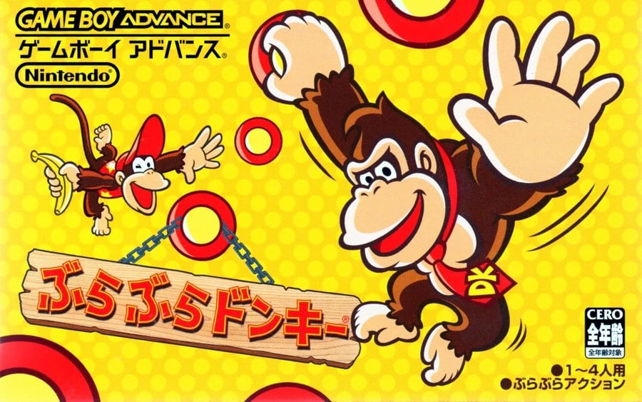
The Japanese cover takes the character art from each of the above editions and puts it onto an all-new yellow background. This is arguably the ‘plainest’ of the three variants, but the multiple pegs are in keeping with the gameplay and we particularly like how the title hangs from one of them on a wooden sign.
Thanks for voting! We’ll see you next time for another round of Box Art Brawl.

