lauren@pcgamer.com (Lauren Morton)
Curated From www.pcgamer.com Check Them Out For More Content.
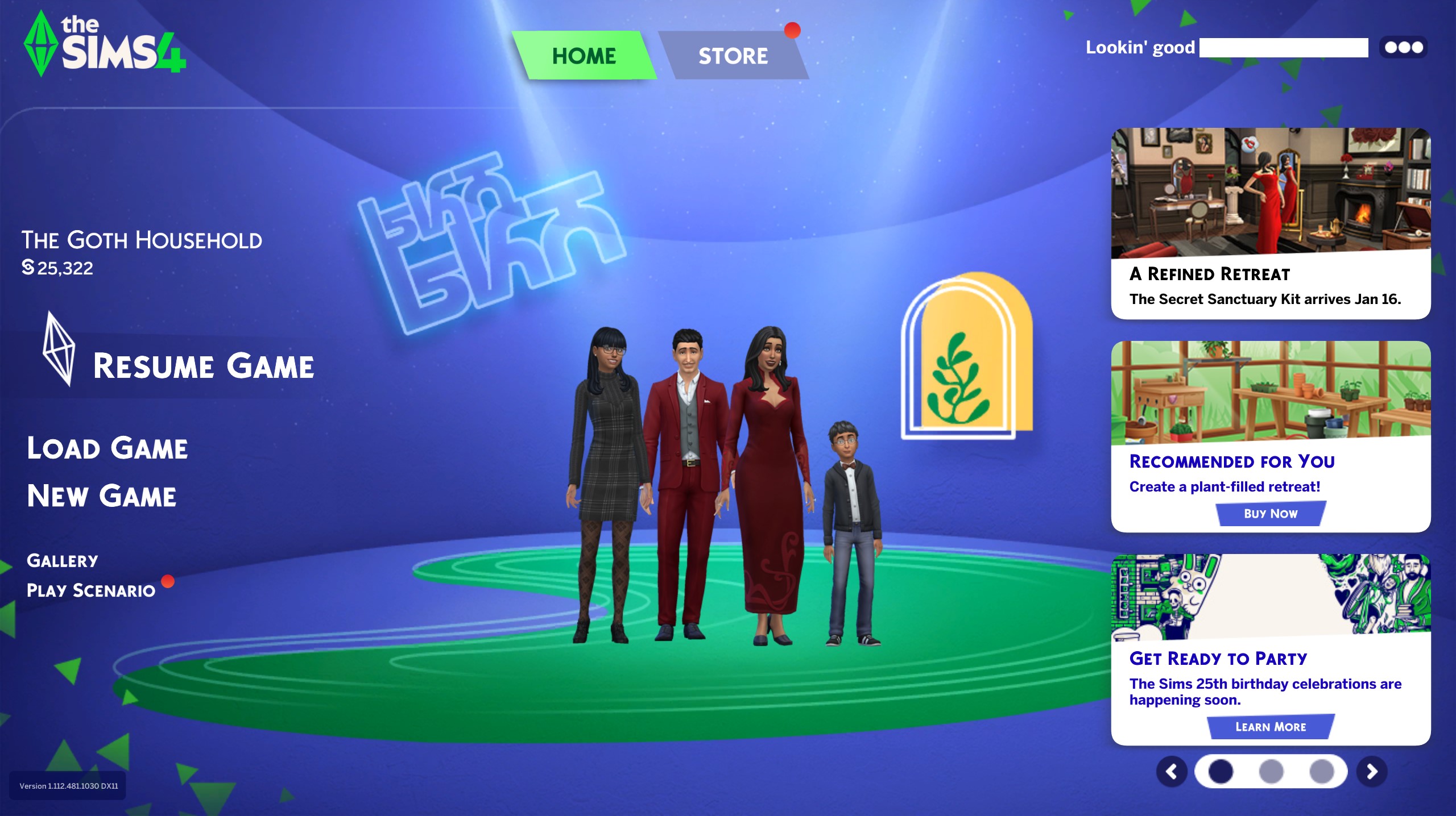
As part of a handful of 25th anniversary updates, The Sims 4 start screen just got a big overhaul. My first instinct was of course to recoil in the face of a major visual change, because even small tweaks to social media feeds activate the human fight or flight response—and this redesign in particular initially had me thinking I should be asking the squad where we’re dropping. But after deactivating my amygdala, I think this start screen is a major improvement over every Sims 4 start screen we’ve had in the past decade.
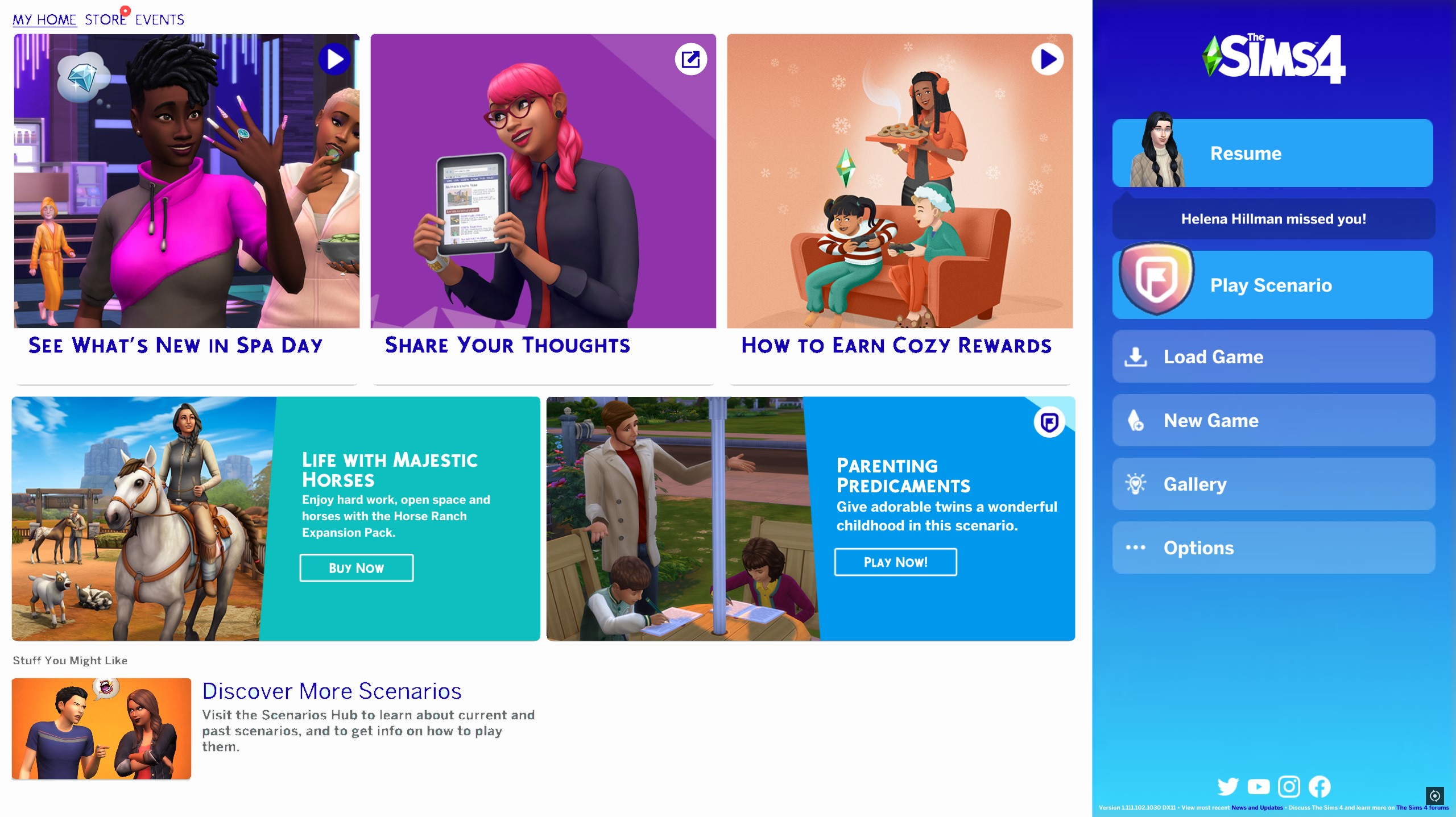
If you’ve forgotten how things changed over the years (I did) the Sims Community fansite has a helpful refresher on several old Sims 4 start screens. Sat next to each other, it’s a little unnerving how the list of packs you own just kept encroaching on the menu over the years until 2020 brought us the panelled look that gives me Windows 8 flashbacks. Lest we forget already, this is what we were rocking as of last week:

It was awful, sorry. It looks like a game launcher trying to cram in the latest update news while enticing me to make purchases, for starters. Somehow there are three different buttons on that screen that want me to try out the scenarios system, which makes no sense. The Sims 4 start screen had gotten pushier than door-to-door pesticide service salespeople.
My fellow Sims-liker Mollie Taylor and I got the chance to talk with Sims series head honcho Lyndsay Pearson leading up to this and other anniversary announcements, during which she acknowledged that information overload was definitely one of the pain points in the old menu.
“One of the challenges is the first thing you see when you open the game,” Pearson said. “There’s probably 100 things we could tell you, right? It could be: what were you playing last time? What is new in the gallery? What is new that you could play that you haven’t played yet? There’s so many messages that could be there. It becomes overwhelming to figure out how to curate where you might want to go.”
The main menu had indeed accumulated approximately 100 things it was trying to tell me every time I started the game. The Sims 4 menu did take a step in the right direction when it added that ‘resume’ button indicating your most recently-played household. The new menu goes all in on that concept and really I dig it.

Squad vibes aside, this menu finally puts my save file front and center—literally. Things like scenarios and the gallery have been moved over to side modules while the ever-present DLC-pushing and the new limited-time events are relegated to different tabs in the menu entirely. It even includes a little context on the family you were playing with their name and household funds.
“What we’ve really learned is, the way that players often come to The Sims is you may play for a lot of time all at once, and then take a little break for a little while,” Pearson said. “But sometimes you forget where you were, so bringing that family front and center is helping kind of draw you back into your story and say, ‘Hey, remember these people? Remember what you were doing here?’ And the sims are the heart of the experience.”
I don’t spend a lot of time praising The Sims 4 lately—it’s got a lot of goodwill yet to claw back after years of buggy DLCs and a lot of confusing communication about future games—but reframing the opening of the game to feature my sims instead of my next DLC purchase does really feel like the right attitude for Maxis to be kicking off 2025 with.
